Oval Airlines
Branding • Typography • Packaging

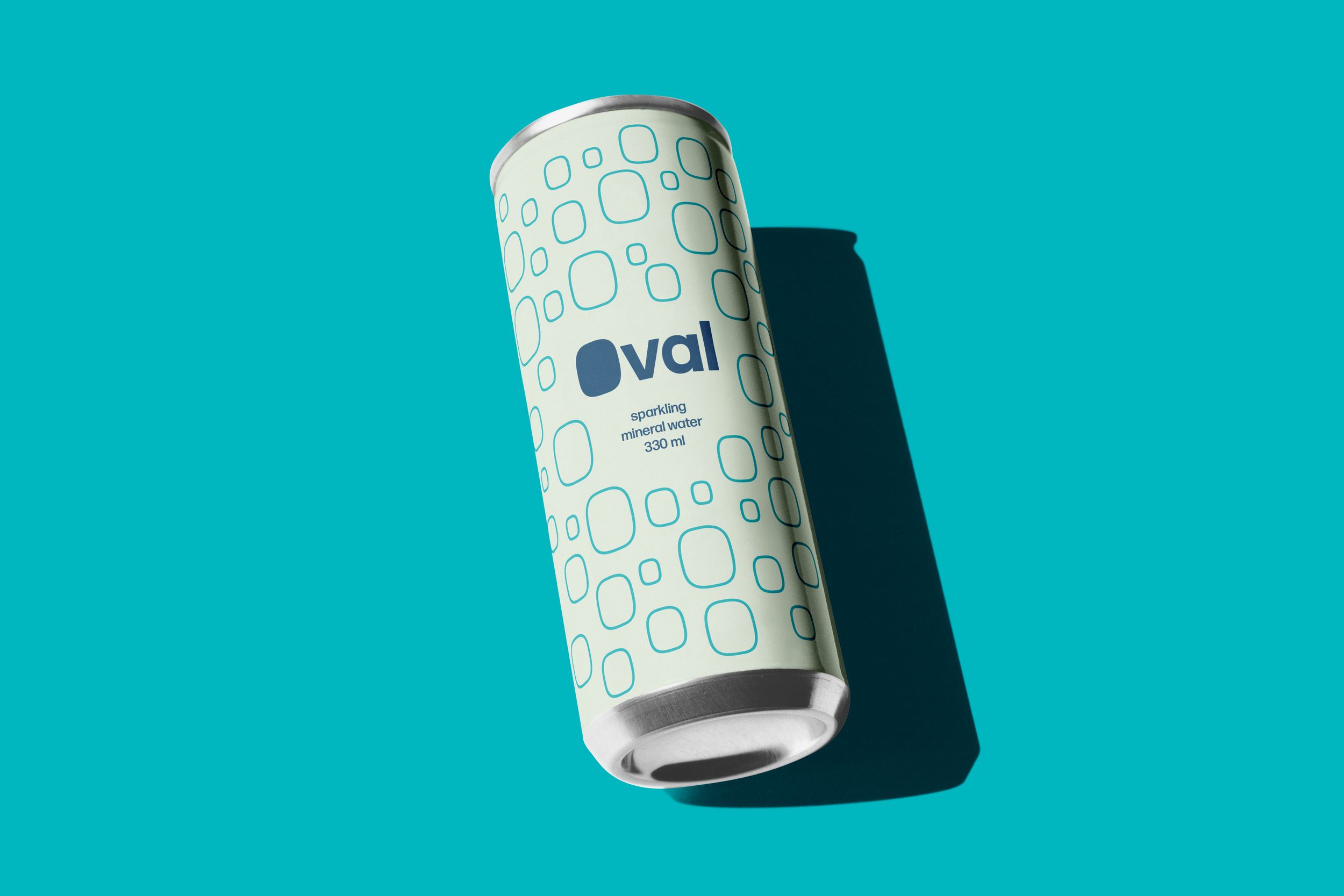
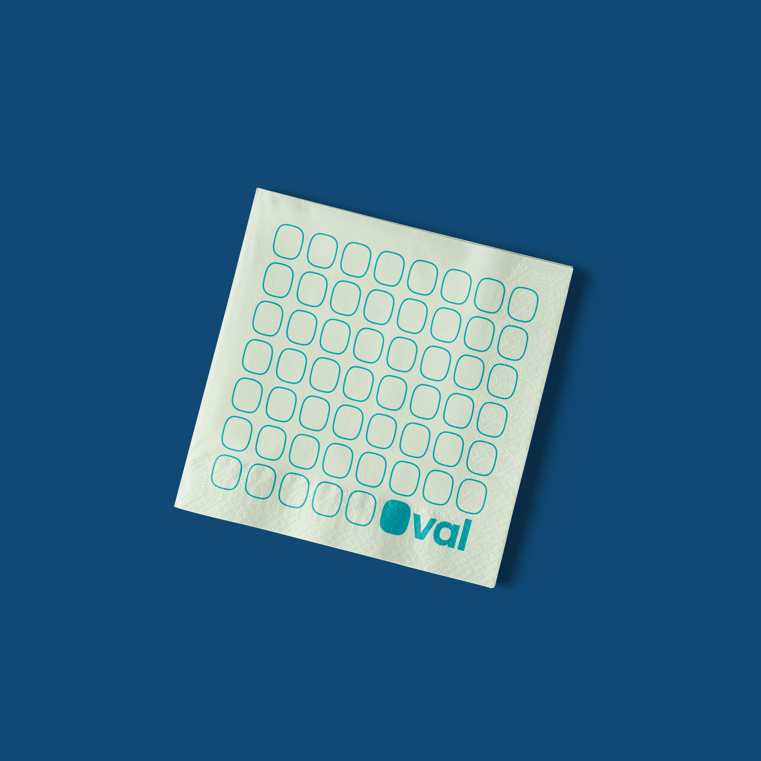
I developed a comprehensive airline brand while studying abroad at DIS Copenhagen in the 7-week Graphic Design Studio course. I took inspiration from Scandinavian design firms which used minimal color palettes and simple, meaningful shapes to create a visual identity. The teal color was inspired by the many patina rooftops you see in Copenhagen.
Oval represents the excitement that comes with travel. Inspired by the iconic airplane window, which provides the first glimpse of a new destination, creating your first impression. The feeling of taking off and watching from the window seat. Seeing the world from a new point of view, through the Oval.
Once I thought of using an oval shape to represent the airplane window, it became a key part of the brand's visual language, as I applied the shape in many ways, developing a brand personality. The Oval logomark is inspired by the Superellipse shape, a blend of a square and a circle, which is popular in Danish design.


